by James Kraus

NBC Peacock, designed by John J. Graham, 1956
There is a distinct lack of coloration in today’s automobiles, with the majority seemingly finished in a shade that could be found on a greyscale chart. Things are no better in the interior; nearly always black, beige or grey, colours that architectural and couture designers refer to as neutrals. To make matters worse, these shades are all too often matched to the exterior pigment (i.e. black with black, silver with grey) to create insidious and mind-numbing monochrome vehicles that appear to have simply been dipped whole into a large vat of colourant.

1937 Delahaye 135, ivory and navy blue with dark red leather
Things were not always this gloomy. From the dawn of motoring through the 1920s, cars were painted in a full spectrum of colours, often in vivid combinations. The world’s first motor vehicle, the 1886 Benz Patent-Motorwagen was green, with its fully-exposed engine finished in bright red. At the Villa d’Este or Pebble Beach Concours d’Elegance one sees a veritable riot of colour that would likely be a bit shocking to today’s consumers: black with orange, yellow with orange, dark and light blue, dark and light green, red with blue, maroon with red; the palette was limitless.
The Roaring Twenties were the heyday of the custom body builder. Wealthy gentlemen would arrange the purchase of a chassis from the likes of Rolls Royce, Delahaye, Duesenberg, etc. and have a custom body commissioned from a coachbuilder such as Hooper, Brewster, Figoni et Falaschi or Franay.

Duesenberg-powered Mormon Meteor in pale yellow with russet leather, black instrument panel and steering wheel
The final design would only be decided after a thorough perusal of sketches, watercolours, leather and fabric samples and paint chips. The designer, with input from the customer, would select shades of paint that would best express the styling of the bespoke bodywork.
By the mid-twenties, mass-producers expanded their array of paint offerings for bodies, fenders and wheels allowing the general public to emulate the colourful custom coachwork enjoyed by the gentry.
The Ford Model T
Many are familiar with Henry Ford’s famous quote: “Any colour you want, as long as it’s black”. When Model Ts first went on sale in 1908, they were red and grey; later dark green and midnight blue. Ford continuously tried to make the car not only better, but less expensive to make and cheaper to buy. Indeed, throughout its 19-year life, the new T was almost always cheaper than the previous year’s T. Anything that sped up production would save money. When Henry discovered that black was the fastest drying paint, that was the end of the other colours from 1915 until 1926 when public demand and increasing competition from brands offering a full palette brought colour back to Ford showrooms.
International Competition Colours
There is a reason that Formula One Ferrari’s are red: tradition. Beginning in 1903, when international automotive competition was in its infancy, each country was assigned a national colour for their entrants. After some early back-and-forth (Italy was originally assigned black), it was standardized for the major countries as follows:
- Belgium: Yellow
- France: Blue
- Germany: White
- Great Britain: Green
- Italy: Red
- US: White with Blue
The U.S. specification originally called for a blue chassis; when streamlined bodies were developed that enclosed and hid the chassis, blue stripes were substituted.

Mercedes-Benz W25 with uncoated aluminium bodywork
German teams were allowed to race in silver cars as well as white when Mercedes was given approval to race their W25 Grand Prix car in 1934 in bare unpainted aluminum to save weight.
Note that the assigned colours represented the nationality of the team entering the race, not the nationality of the manufacturer. Though most teams followed this code in Grand Prix and Sports Car racing, it was not generally adhered to in rallying with the exception of Lancia. Thus, BMC works Healey’s, MG’s and Minis in the 1960’s were red and white, and factory-sponsored Porsche 911’s were mostly Polo Red or Tangerine.
Sponsorship brought the end of the national colour system – it survives in F1 only at Scuderia Ferrari, who have thus far managed to retain sponsors (i.e. Marlboro) whose own colour is likewise red.
* * *
As worldwide economic depression took hold in the 1930s, colours on road cars became less flamboyant and this trend continued in the immediate post-war era.

Jaguar XK120 in Maroon with Biscuit leather
As the automotive industry consolidated, the one-off custom-body business pretty much faded away. Another change was the gradual elimination of running boards and separate fenders that occurred during this period.

Alfa Romeo 6C 2500 in dark navy
Since fenders were now a more integral part of the body, two-tone exteriors became less common and usually involved the roof rather than the fenders. Muted solid colours ruled the roost. Deep blues, greyish greens, maroon, ivories and browns were popular.
Citroën
During WWII, Citroën borrowed Henry Ford’s idea and offered the Traction Avant only in black with yellow, red or ivory wheels, depending on the model. Post-war, it was again available in a variety of colours only until 1948, when, due to material shortages and cost pressures brought on by the post-war recession, it was produced once again only in black until 1954. In a similar vein, the 2CV was only available in grey during its first ten years of production.
* * *
The 1950s brought about a considerable shift in colour preference with pastel colours becoming popular (particularly pale green) and the return of two and even three-tone colour combinations.

Fiat 1100 103 Berlina Lusso in black and maroon two-tone
While most common in the U.S., multi-colour exteriors also appeared extensively in England and Italy, with the Fiat 1100 in particular sporting a number of available bi and tri-tone schemes.

Edsel Pacer in Sunset Coral, Snow White and Jet Black tri-tone
Among most French and German manufacturers’, this trend was more subtle, manifesting itself only in the form of a second contrasting or complementary shade on the roof, rather than involving multiple colours on the main body.

Two-tone Citroën ID19 in Capucine Red with translucent white fibreglass roof
In the 1960s, as fins slowly shrank and disappeared, so did the popularity of multi-tone paint schemes, only to be partially resurrected in the form of the vinyl-covered roof, a curious embellishment popularized by U.S. and later, British manufacturers.

Ford Mustang in Emberglo Metallic with white vinyl roof
In Europe, Citroën, Opel, Audi and Porsche (914) eventually fell victim to the the vinyl roof craze.
Although available since the 1930’s, metallic paints for the first time rose to the top of the sales charts in the U.S. during this decade and remain the favourite today.

Golden Mercedes-Benz W113 280 SL in Tunis Metallic with Anthracite Grey removable hardtop
The most popular were metallic green, blue and turquoise. Gold also found a popular following in the 1960’s for the first time.
The Bertone and Porsche Revolution
When the first running prototype of the Lamborghini Miura was shown to the public at Casino Square in Monte-Carlo prior to the start of the 24th Monaco Grand Prix, its striking appearance caused a veritable sensation. Highlighting the cars sensuous Bertone styling was the colour, an intense bright orange.
The rest of the palette Bertone developed for the Miura was no less dramatic. There was a pinkish raspberry-red, an electric Brambilla Blue and the iconic Pistachio Verde (lime green).

Ferruccio Lamborghini with Miura SV in Arancio Miura (Miura Orange)
The Porsche 356C was offered in a rather muted range of colours. That was to change radically when the 911 entered the scene. In 1965, the new 911 shared the colours of the still-in-production 356. For the 1966 model year however, the 356 was discontinued and a new palatte introduced. The 911 now was available in no less than 39 colours: nine standard shades, and thirty special-order colours.
The standard choices included the enigmatic Bahama Yellow, an ochre-yellow that one reviewer of the 911S likened to Afrikakorps camouflage. It’s an acquired taste – I was once ambivalent, but after owing one, became enamored. It is a multi-faceted colour that changes shading and tone considerably depending on lighting conditions and time of day.
It is also a wonderful period colour. Just as turquoise, pale green and coral red are emblematic of the 1950’s, the ochre coloration of Bahama Yellow announces in no uncertain terms that the vehicle in question dates from the late 1960s or early 1970s.

A pair of Aston Martin DB6’s in Bahama Yellow
A few years later a near-identical hue with the same name was made available on Aston Martin DB6 Mk2’s and DBS’s, as immortalized in this classic clip from The Persuaders.
Someone at the Chrysler Corporation must have also taken a liking to it, as a very similar colour; again with the identical nomenclature, was offered by special-order on Dodges and Plymouths for 1969 and adorned a number of Chargers and Road Runners.
Among the Porsche special-order colours were Signal Yellow (an intense orangeish yellow), Signal Green (the distilled essence of greenness) and Tangerine; colours that remained strong sellers through the early seventies. These grew out of Porsche’s belief at the time that bright colours were safest as they could be easily seen in any weather conditions.

Porsche 911 2.7 Carrera RS in Lilac
Over the next few years, Porsche added Signal Orange, Lilac, Aubergine, Chartreuse, and many other equally vibrant shades. For the 1970 model program, Porsche announced that Slate Grey and Sand Beige were being discontinued because they were “not a good choice for a fast automobile.” A sentiment with which I agree. By 1972, they offered the widest and wildest automotive colour range we will ever likely see.

Lancia Stratos Prototype by Bertone in matt fluorescent red
Other manufactures soon added bright colours to their lineups. While the most intense colours were usually reserved for sporting vehicles (the penultimate being the stunning matt fluorescent red used by Bertone on the prototype Lancia Stratos), bright yellows, oranges, blues and greens quickly spread to mainstream vehicles. Orange became particularly popular in Europe.

Triumph Stag in Topaz with Tan leather, black trim, walnut instrument panel
Black became somewhat of a rarity until the late seventies when two events occurred that would revive black. The first was that when Porsche introduced the 930 Turbo, one of the press cars was black, and that car ended up on numerous magazine covers. Another was a very dark green which appeared black in most reproductions. It is possible that Porsche choose the dark colours to better blend with the numerous black pieces that embellished the Turbo’s bodywork: the rear spoiler surround, the rear stone shields, bumper and sill strips, the front spoiler, etc.

Porsche 930 Turbo 3.3 in black with black leather
The second was that the main character (played by Burt Reynolds) in the Smokey and the Bandit films drove a black Pontiac Firebird Trans Am. These events begat a re-emergence of black on Porsches, BMW’s, Mercedes, Scirocco’s, Capri Mk2’s and numerous others.

Porsche 928 in Lind Green Metallic; Cashmere and Black interior with Black & White Pasha “Op Art” velour
The late seventies also saw an explosion of greens and browns. Browns continued to be popular through the first half of the next decade.

BMW E24 633CSi in Sienna Brown Metallic with Pearl Beige leather, black instrument panel, steering wheel and trim
The big shift in the 1980s was the wholesale conversion to metallic paints around the globe. On most cars since, the only solid colours available are generally black, white and (sometimes) red. I personally prefer solid colours; not only do they provide for much easier repair of minor chips and scratches, they offer much richer coloration. The metal flakes in metallic finishes add sparkle but dilute the base colour. Thus, we no longer see the rich lustrous maroons, burgundys, and dark blues that Mercedes, for example, used to offer in the 1960’s. It would also be good to see light grey (the old Abarth racing colour on most 850TC’s and 1000 Berlinas) again as a nice alternative to metallic silver.
The Functionality of Colour
Most car purchasers chose colour purely on aesthetic grounds. There are however, three functional attributes of colour one might consider. The most visible colour in any weather condition is a light yellow-green. Accordingly, this colour is often seen on emergency vehicles, school-crossing signs and safety vests. Thus, the same or similar colour is safest if one wants to avoid being struck by an inattentive driver.
Depending on where one lives, heat absorption might be a good or a bad thing. As reported by the ADAC (The Automobile Club of Germany) in their magazine Motorwelt in 1969, testing revealed white and silver to be best in this regard followed by yellow, orange and red. Red scores fairly well because, even though it appears dark in black & white photography, it reflects the red (heat) end of the spectrum. Black of course absorbs the most heat, followed by grey and green. Indeed the State of California considered implementing a ban on black automobiles in March of this year due to the heavy burden they place on the A/C system, and thus fuel consumption.

Porsche 911S 2.4 in Chartreuse: possibly the ideal automotive colour based purely on objective functional criteria, scoring high marks for visibility, solar heat-reflection and soil-hiding properties
Finally, light colours are best at disguising road grime and surface irregularities. Because they reflect so much light to the eye, dirt, panel distortion and minor dings are difficult to discern. Thus a white car can hide all manner of sins, while a black car, absorbing almost all light, dramatically highlights any distortion, dust, dirt, haze, fingerprints, orange peel, and swirl marks. Another problem area with dark colours on contemporary vehicles is the clearcoat. All new cars use a colour coat and a clear topcoat. Scratches in the clearcoat appear white, irrespective of the base colour. Thus, a tiny surface scratch that would be nearly invisible on silver will look pretty unsightly on a dark blue or dark grey.
One thing a dark colour will effectively camouflage is large or irregular panels gaps. If contemplating the refinishing of a vintage classic that suffers this problem (i.e. older Citroëns), it might be worth considering one of the mid-tone or darker original colours.
The Composition
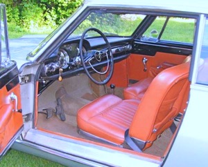
With the fairly limited colour choice available today, its hard to duplicate the handsome combinations that were once commonplace. For example, for a Mercedes S Class in 1968, one could choose among red, maroon, black, cognac, brown, green, parchment, grey or blue leather. Now, you can only pick from black, grey and beige unless you ante up for the Designo program.

Porsche 356B in Aetna Blue with red leather and carpet, black rubber matting and steering wheel
A vintage ensemble I have always enjoyed is a blue exterior with a red interior. This was a popular combination on Jaguars, Lancias and Fiats in the 1950s and 1960s.
Aston Martin DBS in Guardsman Blue with red leather piped in blue
A number of early works Ferraris, including the 340 Coupé of Luigi ‘Gigi’ Villoresi that won both the Monza Inter-Europa and Mille Miglia in 1951, featured the inverse of this combination with traditional Rosso Corsa paintwork and blue interiors. The only place I know of to obtain blue with red currently is on Maseratis and BMW 1 and 3 Series Coupés.

BMW E46 3-Series in Titanium Silver with Natural Brown leather, black instrument panel, carpet and roof lining
One of my current vehicles was special-ordered in 2002 in silver with brown leather. This resulted in raised eyebrows at the agency where the young sales staff couldn’t quite grasp the idea of silver and brown. This is another classic combination rarely seen today, yet it was common on Porsche 356’s and RS Spyders, Ferrari’s, BMW’s and Mercedes right up to the early eighties when the cult of monochrome became ascendant.

Aston Martin DB4 Series II in Goodwood Green with red leather
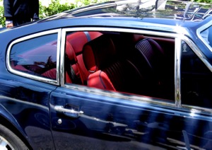
At the mention of monochrome, I also have to wonder why it is that contemporary interiors are in themselves depressingly monochromatic. Does anyone live in a home where the walls, floor and furniture are all the same colour? Note the examples shown here where the carpets were of a different colour to add visual interest to the interior space. Bertone used contrasting carpet to good effect on the X1/9 and Stratos, where red and lime-green cars with black interiors received golden-tan carpet, and yellow cars with black interiors were fitted with red carpet. As recently as the early 1980’s, BMW used to supply a multi-weave charcoal carpet composed of alternating black and grey strands with their black interiors that added a welcome accent and helped avoid the feeling that one was sitting inside an anthracite mine.
Lancia Flaminia Pininfarina Coupé, silver with sienna leather, grey carpet, black instrument panel, steering wheel and door cappings
With any luck, the current era of chromatic asphyxia may be finally be ebbing. Porsche has recently been building some GT3 RS’s in orange and bright green and BMW has just shown an orange M3 GTS.
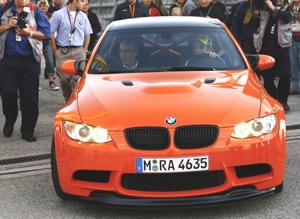
BMW E92 M3 GTS in Fire Orange with black interior and blue seat belts
On the interior front, if you have a Maserati Quattroporte or Granturismo built to your specifications, you can order a complementary or contrasting carpet colour, as well as contrasting or complementary stitching and piping to relieve the monochromacity, and BMW offer at least one two-tone interior on most models consisting of black with either brown, red or pale yellow leather.
___
Related: Radiant Colours of the 1960s

Thank you!
Wonderful article..I have always felt that interesting colours make a car that more interesting to look at and to drive. It is surprising how dull and monochromatic not to forget claustrophobic the interior of cars have become; hope this will change.
PS: Great pictures too…
I became a fan of the red and blue combination since spotting a navy blue Jaguar Mark II sedan with a red leather interior in the early 1960’s.
In addition to the Ferrari’s that left Maranello with a Rosso Corsa exterior and blue leather, I have come across at least one Miura finished in Miura Orange with a blue interior.
An orange Miura with a blue interior? Wow! Maybe that was the inspiration for fitting blue seatbelts in the orange M3.
While I heartily applaud any injection of colour into the interior (especially into a black one) I am not sure coloured seat belts are the best answer. I know that Porsche has been offering them for a while along with some other manufacturer’s, but colour draws one’s attention and I am not sure that the seat belts are the proper recipient as they certainly not in and of themselves intrinsically attractive.
There is also at least one early 308GTB out and about in Giallo Fly (bright yellow) with black leather and blue carpet.
I do not know if it was the idea of Ferrari, Pininfarina or the customer who commissioned it, but it looked brilliant. Last I heard, Ferrari does still let the customer separately specify carpet colour.
I too find monochromatic cars (and interiors) rather insipid.
Thank You! Great article. Monochrome is just one of the inherent ‘design by committee’ approach to car styling’s many mediocrities.
I would heartily embrace the return of orange. Who can forget the classic orange NSU TT’s:
or the Mercedes-Benz C111:
http://www.lotusespritturbo.com/Mercedes_C111.htm
Your description of black, beige and gray as neutrals was spot on. Note that the Latin root of neutral (neut) is shared by neuter (to castrate) – that is what black, beige and gray are: castrated colors. They should be used in combination with vivid (testosterone-rich, if you will) colors to keep things in balance.
Black with black leather = dreadfully dull. Black with a rich brown or glowing red = classic.
Pingback: D&S 5: Looking forward « Alfa Romeo Giuliettas
Bahama Yellow è bellissimo! Count me as a big fan. An interesting note for other enthusiasts of this beguiling colour: Porsche actually produced two slightly different shades of this paint. The original was code 6605. Beginning in late 1967 the code changed to 6805. The 6805 is more of a pure yellow/orange representation, having less of the brown/olive undertones of the original. While both are attractive, I personally prefer the complexity of the original formula.
An excellent article. I’ll add, there are a few manufacturers that deserve note for their more recent, brave and probably unpopular option of non-metallic colors -which I covet. Oddly, Nissan, with its Xterra line has offered a gorgeous smoky whale blue, a rich olive green, a pumpkin soup, yet it’s Audi’s use of battleship gray on the TT (typically paired with a claret red interior) that really floats my boat high.
This is one of the best weblogs that I’ve ever seen.
Brilliant article JK!
I was once a prisoner of the greyscale colour palette — never black or white, however — but my first Alfa Rome 75/Milano in metallic Azur liberated me! That was followed by metallic light and dark blues, as well as solid red and orange cars. My current Land Rover LR2 in Tambora Flame over ebony with ivory roof liner seems to echo the lovely NSU and Merc exterior colours that Hans illuminated:
https://picasaweb.google.com/lh/photo/TTZkYH762pHfkJi80Bijkd9POVCjte5t7FM-W3Zgiuw?feat=directlink
Like JK and some of the others; however, I do also love the classic combinations: red over blue, blue over red, red over biscuit, and silver over blue being my favorites.
Also, I have had intimate contact with the Fire Orange M3 GTS and, I concur, it does have an arresting presence.
Excellent, wonderful article, thank you!
Thank you for this article… I have been wondering for years what is going on with the monotone colours of today! I love the cars from the 50’s! Unfortunately the way your article reads, the only hope for the future of colour is in sports cars.
As one reader suggested, you wouldn’t decorate your home all in one colour – why do we do it in our vehicles? I will keep hoping the car companies get into this new century and give us more choice! Take a look at an old 50’s car lot and one of today…boring!
Outstanding insight, good history lesson for those not in the business, and great expression of passion for a topic that most anyone can relate with. I am an enthusiast, and also a student of long-term economic cycles.
I am looking for correlations between colours and the economic landscape of the era; ie, deflationary eras beset by economic retrenchment (1925-1947, 1980-2002) have tended to offer less flamboyant colours, whereas inflationary times where the economies are generally strong and debt free-flowing (1947-1980, 2002-2035) will tend towards more colorful offerings.
Great article! Happy to report I am bucking the boring trend as we ordered a new 2016 Mustang GT last year! The colour? Competition Orange.